'The Penguin' logo Easter Egg Explained: The blink-and-you-miss-it nod was subtle indeed

'The Penguin' on HBO has turned out to be one of the most loved shows of 2024. The spin-off show in Matt Reeves's 'Batman' universe serves as a bridge between his 2022 film 'The Batman' and its highly anticipated sequel, scheduled to release in cinemas in 2026. Apart from compelling performances and engaging narrative, the show kept the audience hooked with multiple Easter Eggs, serving as a nod to DC Comics.
While every episode initiated discussions among fans as they took to social media revealing all the Easter eggs that they spotted, a less popular Reddit thread has caught our eye where fans posted a cool detail in the show's logo that most people have missed.
Fan explains an intruiging detail in 'The Penguin' logo

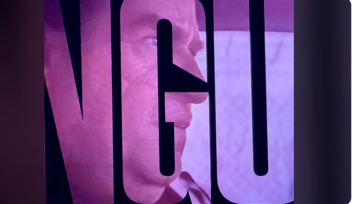
The "G" in 'The Penguin' title isn't just any "G." The negative space there seems to hint at a beak, nodding to the main character’s iconic profile. A fan pointed out that the "G of the Penguins title font represents his classic cartoon profile, including pointy nose."
After looking at the picture that overlays Oz's face on the logo, fans are convinced that the logo does mirrors the shape of Colin Farrell’s Penguin, complete with his unique look behind layers of prosthetics.
Our take on the Easter Egg in 'The Penguin' logo

Whether the resemblance of the "G" in the logo to Oz’s face was a deliberate design choice or just a happy accident during editing remains unclear. In any case, we are happy that the creators of the show didn't let this tiny detail slide but instead chose to embrace it by aligning the font with Farrell's profile in one scene. This definitely is a clever Easter Egg that adds to the show's gritty vibe and serves as a reminder how small choices can make a big impact in storytelling.
'The Penguin' concluded its run with Episode 8 and all the episodes are now available to stream on Max


