Amazon scraps 'Hitler mustache' from icon, Internet jokes peeled-back tape in new logo shows 'poor packaging'

The Amazon app on Android and iOS had a major redesign in January. From the layout and user interface to colors, Amazon changed everything about the app, including the icon. However, the tiny icon made waves on social media, not for its refreshing new look, but its resemblance to a particular historical figure.
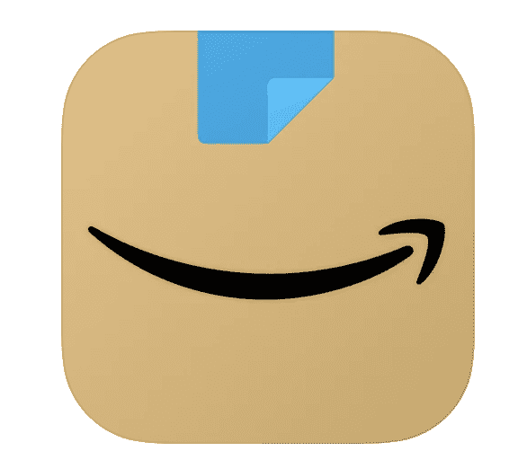
At the time of the rollout in January, an Amazon spokesperson said, "We designed the new icon to spark anticipation, excitement, and joy when customers start their shopping journey on their phone, just as they do when they see our boxes on their doorstep." However, it seemed that the icon sparked anything but joy. Amazon has now quietly updated the logo, but the new one is still getting a lot of hate online.
Compared to Amazon's other controversies, this one seems a little easier to fix. Just go back to the old icon right? Well, it seems like that won't be happening any time soon.
RELATED ARTICLES

Icon resembles Hitler's 'stache
The January app update featured a brown Amazon box with the trademarked smiling arrow. It also had a blue tape on top, designed to look like it had serrated edges. However, many quickly spotted that it looked not like packing tape, but a toothbrush-style mustache. That evoked quick comparisons to Hitler's mustache. To be fair, the style was popularised by Charlie Chaplin back in the 1900s. Other notable toothbrush mustaches include George Orwell, Oliver Hardy and even Michael Jordan. It is impossible though to think of Hitler when you see the style.
So naturally, Twitter had its fun, with one user repeatedly using the line, "Amazons new App logo Does not remind me of Hitler..." in a tweet.
Amazons new App logo Does not remind me of Hitler... Amazons new App logo Does not remind me of Hitler...
— Phil Whitford (@iamphilwhitford) January 26, 2021
Amazons new App logo Does not remind me of Hitler... pic.twitter.com/CAx0kWKeDm
Surprisingly, Amazon took a month to update the logo. It now features a much less controversial piece of tape, folded at one edge. So surely that would have solved the issue right? Well, it appears not.
Internet still hates the new logo
Despite the update, many on Twitter still seem to hate the new logo. People may seem to love Amazon's boxes, but clearly not on their screens. A user posted: "Amazon changing their app icon really has me messed up this morning". Another tweeted, "Amazon changing its icon really ruined my whole home screen". Home screen concerns seemed aplenty, with another user tweeting, "who tf let amazon change their app icon it messed up the whole feng shui of my home screen".
Amazon changing their app icon really has me messed up this morning
— tor (@toridrainer) March 2, 2021
Amazon changing its icon really ruined my whole home screen 😐
— purplepinkskies(taylor's version) (@purplepink2704) March 2, 2021
who tf let amazon change their app icon it messed up the whole feng shui of my home screen
— Betsy Norwood (@betsymnorwood) March 2, 2021
Another user said the peeled-back tape in the new logo shows 'poor packaging': "And to more accurately reflect their poor packaging". Others called for the old shopping cart icon back. With one user saying, "Jeff Bezos has a lot of nerve making 24 bazillion dollars a nano second and not hiring someone to create a better amazon app icon I get the idea but it’s ugly I want the old icon back." Another said, "This Amazon app icon is trash. Change it back."
And to more accurately reflect their poor packaging 😂
— Bobby Castle (@koreankamakazi) March 2, 2021
Jeff Bezos has a lot of nerve making 24 bazillion dollars a nano second and not hiring someone to create a better amazon app icon 🙄 I get the idea but it’s ugly I want the old icon back.
— cynical milf (@mckenzie_halie) March 2, 2021


