'100 Day Dream Home': Here are 2 design tips from Brian and Mika Kleinschmidt that'll make your home look bigger

Season 2 of '100 Day Dream Home' kicked off with the same infectious energy that Brian and Mika Kleinschmidt always bring to the table. For the very first episode of the season, the couple sets out to help Trey and Zoe, two law enforcement officers who own a gorgeous 8.2 acre land in Plant City, Florida. The young couple, who are scheduled to get married in a little over 100 days, currently live in an RV that's cramped beyond measure. The land they own is absolutely beautiful, filled with greenery and local wildlife. It is the perfect place to build a home and start a new life.

Brian and Mika see the challenge they're up against. They have to finish the house in 100 days, seeing that Zoe and Trey definitely want to start their married life in their own home and not in an RV. Although Brain and Mika don't waste a minute and get right to work, there's a lot of mishaps along the way — sudden torrential downpour almost has Brian failing a land inspection and later, Mika finds out that the counter tops that the couple unanimously approved are out of stock. But in classic Kleinschmidt fashion, the couple works their way around the chaos and finish the couple's new home within the time frame, while managing to keep it under budget. Brian and Mika create yet another gorgeously stunning home, that provides viewers with a lot of inspiration for their own DIY home makeovers.
White helps you make your home look more spacious

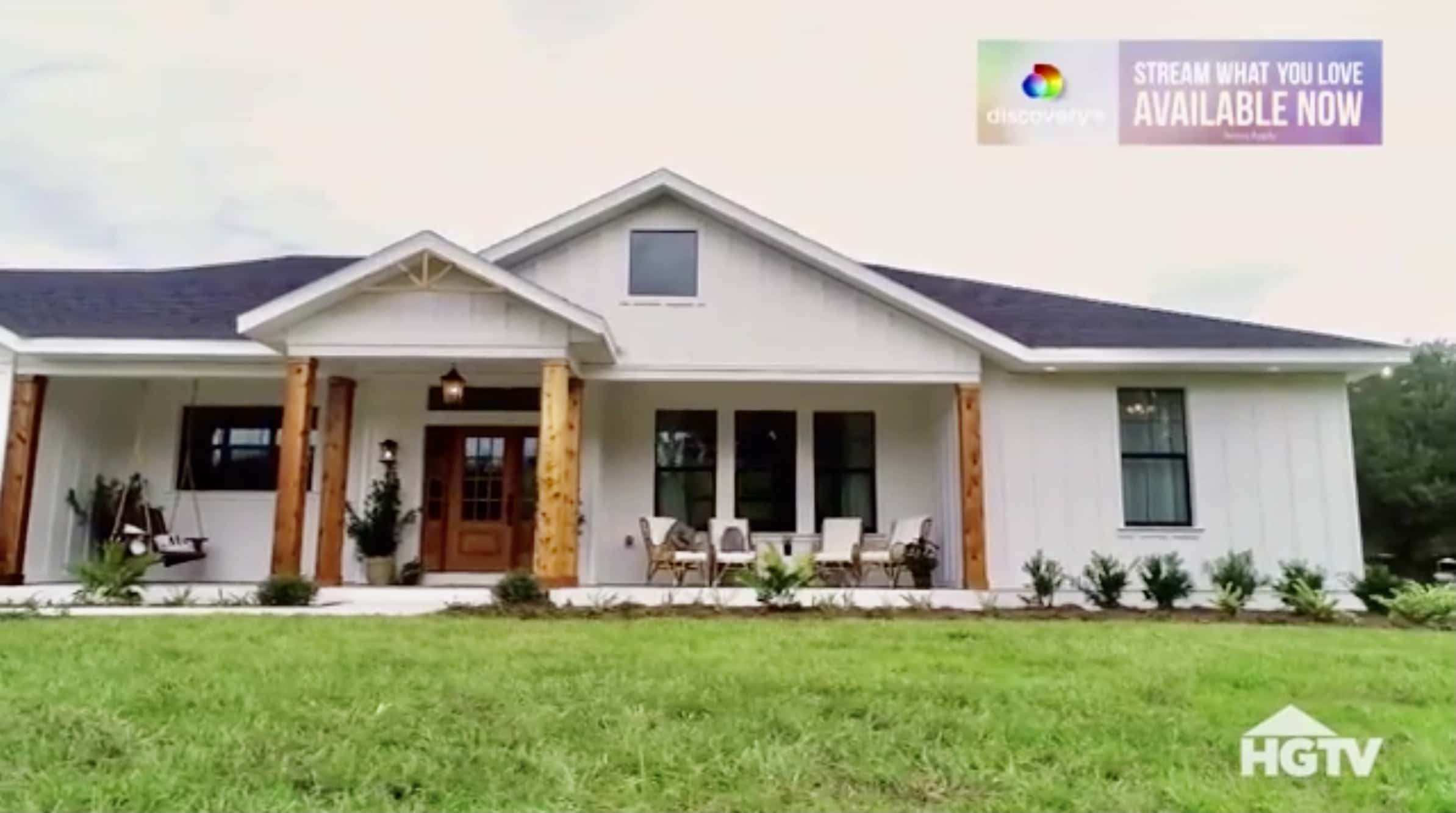
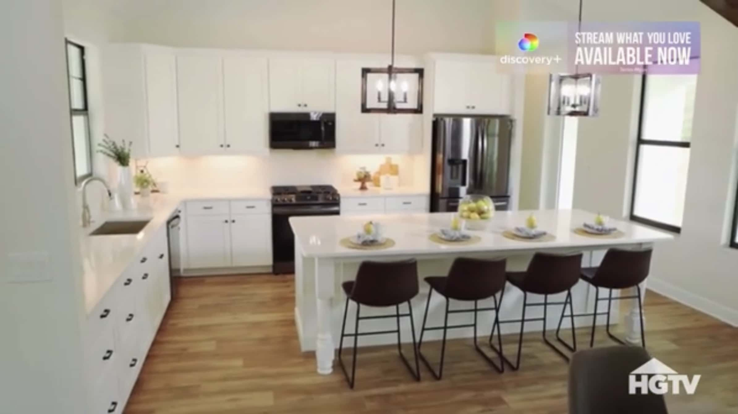
Zoe and Trey were very clear about one aspect, while they wanted a rustic, farm look to their new home, they also wanted the house to look more open, without exactly adopting the open floor layout. It's here that Mika uses a tried and tested method to incorporate this request into the design process. She goes with plenty of white to open up the entire house. By combining it with large windows, Mika ensures that there's plenty of natural light streaming in. Seeing that white reflects light, the combination is always one that wins. It allows your space to look open, airy and bigger than it actually is. Mika uses this concept while furnishing the house as well. She opts for white cabinets and drawers in the kitchen, allowing the living area to seamlessly transition into the kitchen. This makes both areas seem open and inviting.
Wood tones can help break the monotone

Nothing says 'rustic' quite like the way gorgeous wood accents do. Seeing that Zoe and Trey were going in for a farmhouse look, Brian and Mika knew that wood features and accents were a must. But, the couple did mention on the inspiration tour that they didn't want the wood to be an overkill. Striking the right balance is key here, seeing that the entire house is white and that alone can get overwhelming, if not contrasted correctly. To counter this, Brian and Mika go in with two wood tones — a lighter shade for the floor and a much darker, oakier colour for the furniture and the accents. It strikes just the right balance. The floor compliments the white walls while the accents act as a contrast. They also use the same tone to refurbish the couple's old porch swing, to create a sense of uniformity between the front porch and the house, so that it doesn't look like two segregated elements.


